Redesigning trust
Designing brand, identity and web presence for a defence M&A firm, Steen Associates
My Role
Product Designer
Focus
Product Strategist, Brand Design, Web Development
Time
Feb 2026 - May 2026
The Problem
Steen Associates had the credibility.
What it lacked was a presence that showed it.
Steen Associates had been quietly doing serious work for years. As a boutique firm specialising in mergers and acquisitions within the aerospace, defence and industrials sector, their credibility came from relationships and results, not visibility. But the digital world had moved on, and their online presence had not kept up. The website was outdated and the firm had no real way to engage potential clients beyond word of mouth.
They needed more than a new website. They needed a presence that matched the weight of what they do.
The Approach
Starting with identity
Before any screen was designed, the foundation had to be right. I brought in a brand and visual identity collaborator to work alongside me on this. Together we approached the rebrand with one question at the centre: What does trust look like in a high-stakes industry?
The client envisioned a new brand that would be updated but would also stay close to its inception. The vision was already there.
We started by refining the colour palette, staying close to the primary blue, but introducing supporting colours that strengthened it. The additions weren't departures; they were there to reinforce what blue already does well: communicate trust.
Primary colour
Blue 200
Blue 400
Secondary colour
Gold 200
Gold 400
Gold 600
Colour & Tone
A refined colour palette, grounded in tones that signal authority without coldness. A visual guideline that gave the logo and the broader brand system a clear logic.
The Logo

The original word-mark was sharp and deliberate for a firm operating in a serious industry. But sharpness had come at a cost. The kerning was off in places, and to maintain that lean, precise quality, the letterforms had been drawn narrow enough that the logo lost some of its presence.
We explored two directions:
Variation 1

The first leaned into the personal. Since Steen is the founder's surname, we explored a version that drew from the fluidity of a signature. It had character, but it pulled the brand in a more personal direction than the firm's positioning called for.
Variation 2

The second direction held on to the sharpness of the original but approached it differently. The letterforms were drawn bolder, giving the wordmark the weight and authority it had been missing. To keep it from becoming heavy, the strokes taper toward their endings, so the logo reads with both strength and precision.

Designing with clarity
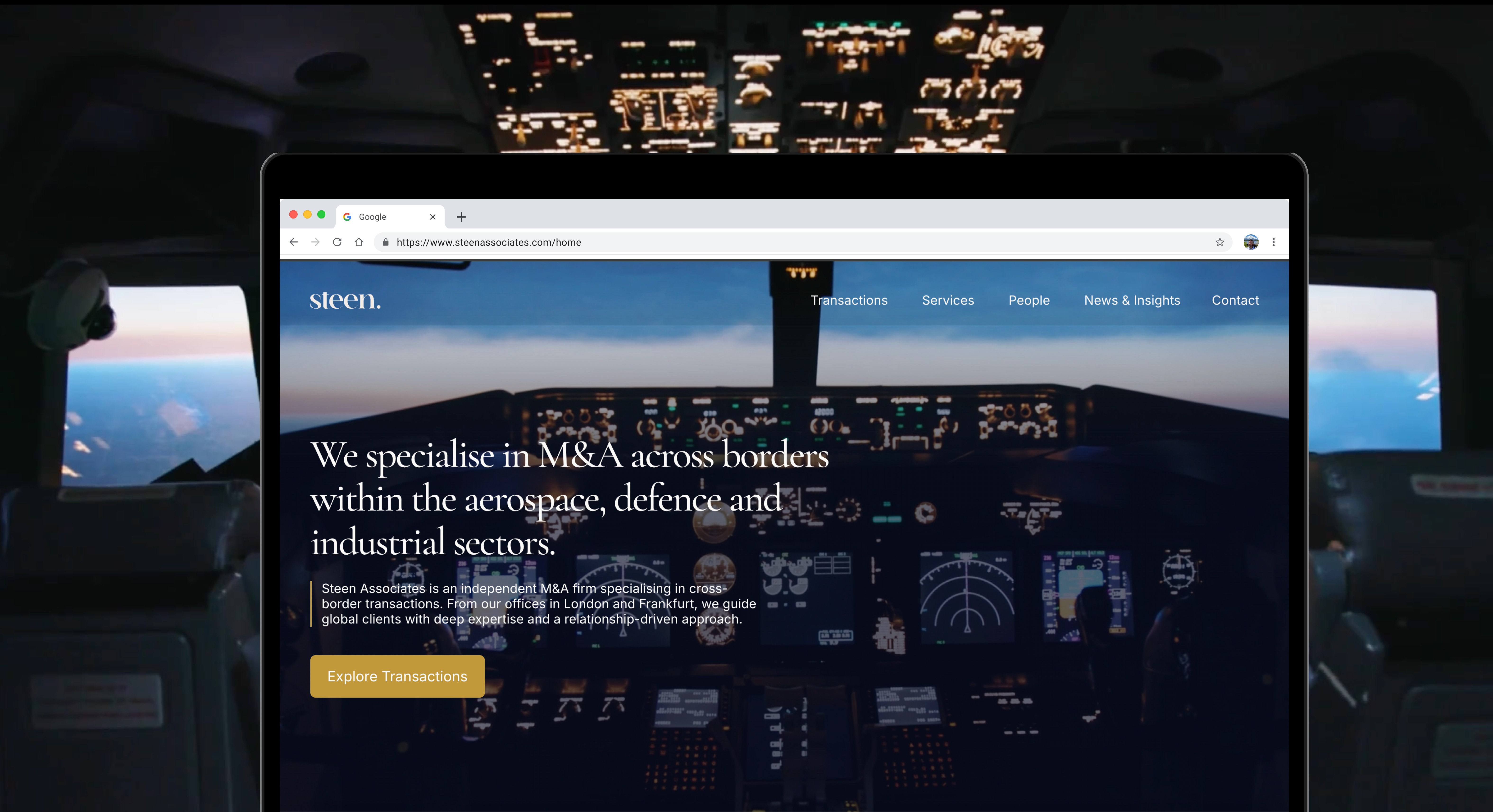
The old website was brief and to the point. But the hero section tried to do too much at once. It had information about who the firm is, what they do, and their latest news all cycling in one scrolling block. If you wanted to find transactions or services, you had to go looking on your own.
The old design packed everything into one place.
The new homepage gives each piece of information its own space. The hero now only introduces the firm. Who they are, that they specialise in M&A, and that they operate in aerospace, defence, and industrials. That is it. Nothing else is competing for your attention at that point.
The homepage now acts as a connection point to all the detailed pages, sectors, services, news, insights, and leadership. But it gives you enough that you do not have to go there immediately. People are spending more time on the homepage now. That tells us the structure is working.
This was especially important to get right for two kinds of visitors.
Senior professionals who already know the space and do not want to dig around.
And potential collaborators who are new to the defence world and need a clearer picture before they can even know what questions to ask.


Building a new kind of touchpoint
One of the more strategically interesting additions to the site was the Insights page. Steen Associates publishes reports relevant to their sector, and previously those reports had no real distribution mechanism tied to the business. The new page gates access to those reports behind a simple email request.
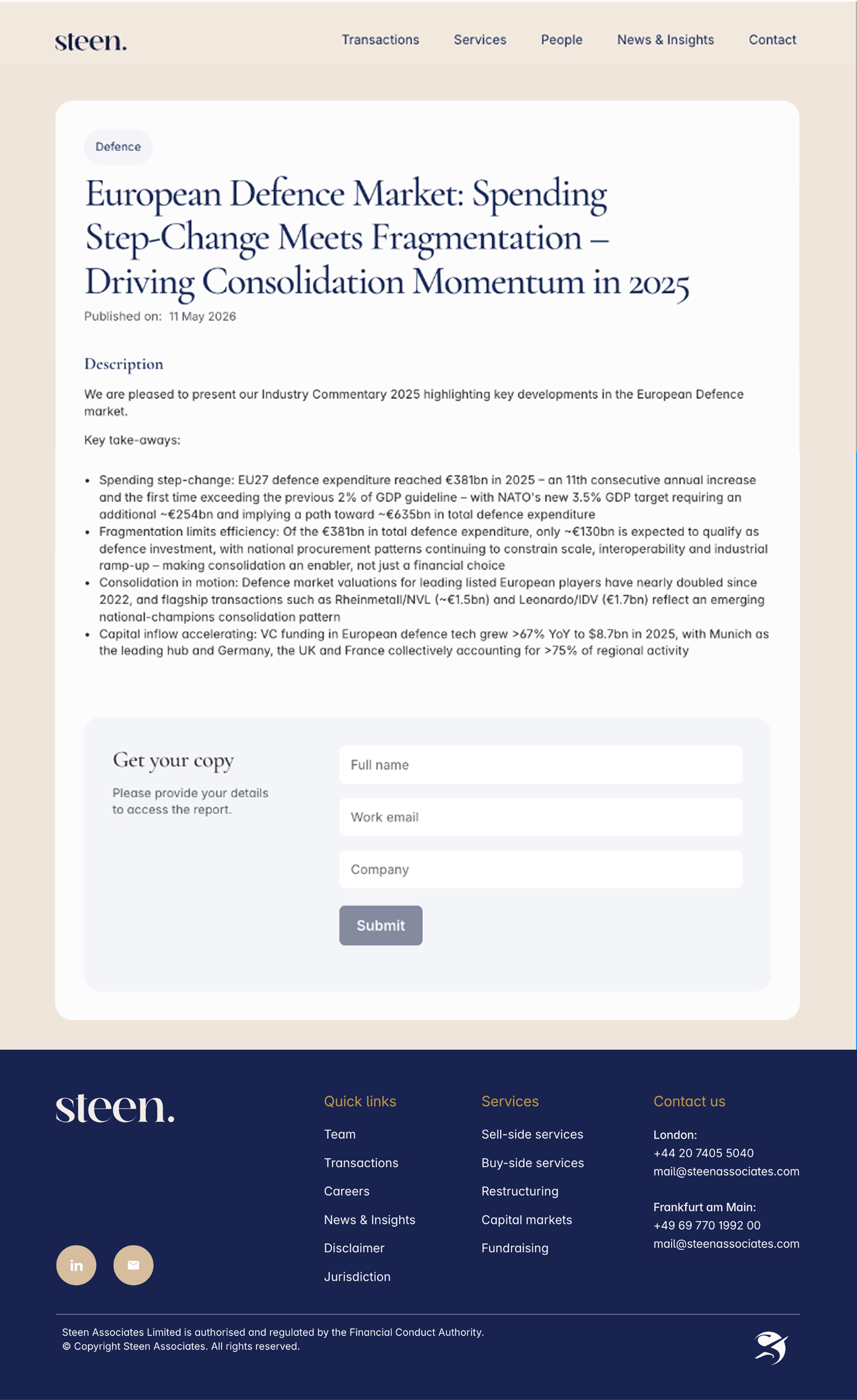
For the visitor, it is a frictionless way to get valuable content.
To access a report, a visitor submits their name, email, and organisation, and the report is sent directly to their inbox. For the firm, this is a quiet but valuable tool. They can see who is reading their work, and follow up with the right people at the right time.
It tells them how their reports are performing and surfaces potential clients they can reach out to directly. A small page with a long tail of value.
What the project delivered
A brand with a clear visual language. A website that works as a business tool, not just a digital brochure. And a firm that now has the kind of online presence that reflects the seriousness of what they do.
Sometimes the work is about building something new. Here, it was about making the outside finally match the inside.


