Redesigning Ed-Tech mobile app
UX Strategy & Design | October 2021 - April 2022

The Byju's Aakash app is a freemium app for NEET & JEE exams that presents the chapter concepts in concise & compartmentalised videos, providing users with a solid foundation for understanding.
Users were losing interest and abandoning the app within the first 10 days of its use. The decline eventually brought the engagement rate below 3%. After the initial launch, there was a significant drop in user retention, with users quickly losing interest and abandoning activities on the app, after its first use. This resulted in a sharp decline in the engagement rate within the first seven days.
MY ROLE
As a senior UX consultant, my role involved collaborating with a cross-functional team of five, including a principal UX designer, UI lead, lead product manager, and two additional product designers.
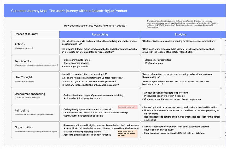
RESEARCH
Identifying areas for improvement based on:
We initiated the process by analysing behavioural metrics data that guided our research and help us pinpoint specific areas of problem that required attention & improvement.
Behavioural Metrics:
User's data suggested some behavioural patterns among the users which shed light to the problem areas
User engagement decreased towards each chapter's end
"
CTR metrics highlighted a low percentage of users continuing with the same chapter on subsequent days, indicating a high rate of abandonment after starting the chapter.
Minimal interaction with some features discouraged users from upgrading
"
Limited engagement observed with the additional features designed to support users, indicated a significant lack of return on investment (ROI) for these features.
How might we empower users to finish tasks?
Competitive Analysis & User Interviews

Mapping 3 top competitors with our product
Byju's Aakash App
Unacademy
Toppr
Allen's Digital

Aligning user requirements with the existing product interface
Byju's Aakash App
Data from usability tests and interviews
Key takeaways from user interviews validated with competitive analysis
Users expressed the need for intuitive assistance to support their self-coaching efforts
"
The lack of assistance in decision-making during app usage led to a decline in interest, a gap that was also evident from competitor analysis.
Endless scrolling and the absence of convenient access to various features added to the exhaustion
"
The linear flow of information in the existing IA posed challenges in quickly changing chapters and subjects, requiring users to navigate back extensively.
How can we align the flow of information with the student’s mental model?
DESIGN OUTCOMES
Restructuring the flow of information to match the system to real world
Opportunity:
Restructuring the flow of information to match the system to real world


What are the issues the final design aims to address?
The existing linear flow was restructured to prioritise content based on user intention. The previous emphasis on subjects in information architecture was replaced with two distinct modes: Learning and Practicing.
Old Information Architecture

-
The flow of information was linear, The users were abandoning a task to move to another.
-
System status visibility was very low
-
Incompetent Mental model
New Information Architecture

-
Information flow is compartmentalised and connected reducing cognitive load
-
The user is made aware of previous interactions with recommendations and summary
-
Information is segregated and organised as per the user's real-time studying
Other highlights from the redesigned product
By restructuring the information architecture, we created opportunities to introduce new features that facilitate intuitive learning and decision-making for users.
Personalised recommendations for returning users & trend-based suggestions for new users
Opportunity:
Help users recognise than recall

Revise mode was introduced in the new design, offering timely prompts and enhancing the guided learning experience. Users were recommended to restart a chapter video or practice exercise paper based on their previous interactions.


What are the issues the final design aims to address?
-
The new design incorporates subtle nudges to maintain the essence of revising a concept, prompting recurring users to revisit activities as needed.
-
The redesigned interface also assists new users by recommending chapter videos or practice papers based on external activities, such as the ones with the highest number of visits. This approach aims to reduce the feeling of overwhelm when faced with a wide range of options.


Journey of learning concepts with interactive features and design
Opportunity:
Promote visibility of system status

The user maintains detailed control over their learning journey, supported by seamless micro-interactions that provide feedback on their progress within each chapter. These interactions strike a balance between maintaining focus and allowing flexibility for the user.
What are the issues the final design aims to address?
-
The new design minimises distractions by auto-playing the next video within the chapter allowing seamless exploration of subsequent videos, eliminating the need to navigate away from the page.
-
The user enjoys the convenience of accessing and starting the subject's practice paper directly from the same page, eliminating the need for unnecessary navigation.
MEASURING SUCCESS
Handholding users in taking a decision and completing a task
In April 2022, I handed over the design system to the designer and product team for the app's launch.
The beta version was successfully released by early December 2022, resulting in a significant increase in task success rate by approximately 59% and a notable decrease in the bounce rate by around 47%.
How can it be better?
To ensure a guided learning experience for the users, I worked on a few focus areas before I left the project:
-
Introduce scheduled learning: Aakash offline coaching centres' conceptual learning approach can be extended to premium users by implementing a finalised schedule that guides users on which chapter to read each day, leveraging the expertise of Aakash coaching.
-
Insights based on performance: To develop the existing performance analysis to give more personalised insights on what the user should focus on based on their performance in the practice papers.