Redesigning a game to improve user experience
UX Strategy & Design | July 2021

BOLO is the only game in the Byju's Think and Learn English mobile app that focuses on correcting the user's pronunciation. But it had the lowest completion rate where users were dropping off before the total attempt time.
The Byju’s Think and Learn English app was designed to help students under the age of 14 learn and practice English through a fun, gamified experience.
BOLO game experienced a low completion rate of only 40%. Additionally, the reattempt rate steadily decreased over time, suggesting a declining engagement level among users.
MY ROLE
As the sole UX designer, my primary responsibility was to collaborate with the development team and align the game with the product vision, ensuring a seamless user experience and maximise completion rate.
RESEARCH
Identifying usability issues and pain-points
Key Takeaways from usability tests conducted with 20+ students from grade 1 - grade 5

-
Lack of Intuitiveness and Synchronisation
The absence of real-time responses caused confusion for users.
-
The exhaustion of the unknown
The game lacks emphasis on the time stamp, an integral component.
-
Lack of personalised feedback after the game
The result screen in the game remains the same for every user, regardless of their performance.
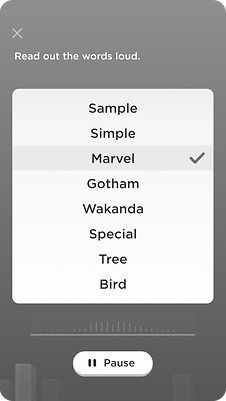
Overview of the previous design: Words appear on the screen for users to pronounce, and once recognised, they are replaced with new words.
Contributing factor to the negative experience
New words appear on the page with much delay in replacement of a correct word. This delay causes the appearance to look haphazard.

For “Wonder” to be recognised correctly, the algorithm will take 45-50 milliseconds to respond with feedback. In a time-sensitive game, this delay is a significant gap adding to user friction
"
Aligning insights from Heuristic Analysis with Octalysis framework
Meaning:
Introduce levels where the users only upgrade to complex words based on their performance
Empowerment & Scarcity:
Introduce a mechanism that utilises the time-delay as part of the games, adding to the feeling of time scarcity
Social Influence:
Personalising the microcopy to match the performance of the user.

VISUAL COMPONENT EXPLORATIONS
Design Iterations and Final Design Decisions


DESIGN OUTCOME
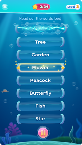
Progress through levels based on performance, creating a game for all players


Core Principle: MEANING
The game incorporates progressive growth, enabling beginners to build confidence in pronouncing words while experiencing a sense of achievement as they advance through levels.


Converting the time delay into a visual timer to provide users with a clear sense of progress and anticipation
Core Principle: EMPOWERMENT & SCARCITY
In the interface redesign, I implemented a positive feedback mechanism that provides confirmation when a word is correctly recognised. In cases of incorrect pronunciation, the word remains on the screen for a brief period, allowing the user to make another attempt before disappearing.


MEASURING SUCCESS
In the post-UX development phase, I collaborated with the Visual designer and tech team to bring the final output to fruition. The updated design was seamlessly integrated into the app by the end of October 2021.
With a completion rate exceeding 90%, all participants successfully completed the game, demonstrating their engagement and commitment.
