Designing a subscription-based fintech app
UX Design. September 2021 - December 2021


Scribbr is a fintech mobile app that lets users manage all their subscription-related payments on the go. It helps users to track, add, seamlessly pay, and manage other things related to their subscriptions.
The main focus of this project was to understand the innovators' vision and design the features to provide a gamified experience.
MY ROLE
I led the UX analysis, ideation and construction of information architecture. I designed some key features of the app explained in this case study
PROBLEM STATEMENT
The challenge was to design a reward system for the payments process through the app.
We conceptualised the features and designed the interface that would go into the reward system. The reward system had two focuses,
1. to boost user engagement apart from paying for the subscription
2. incentivise potential users to take the first step
KICK-OFF
We started the project with a discovery workshop with the startup founders. The goal was to comprehend their understanding of the market and their vision. Due to time restrictions and budgetary constraints, we went forward to establish the potential user group with a quick quantitative survey among 65 users who use different forms of online payment apps.
Savvy Adopters
-
They do not mind the time required in engaging with different features
-
They often plan their payment behaviours to earn more reward points
Casual Users
-
They prefer using a product only if it simplifies their day-to-day activity
-
They often get overwhelmed with too many options to choose from
Competitive Analysis
To validate user insights from our quantitative survey, a thorough UX analysis was done of five indirect companies that have similar user groups
Effective Navigation Approach
Effective Information Approach

FAST ITERATIONS
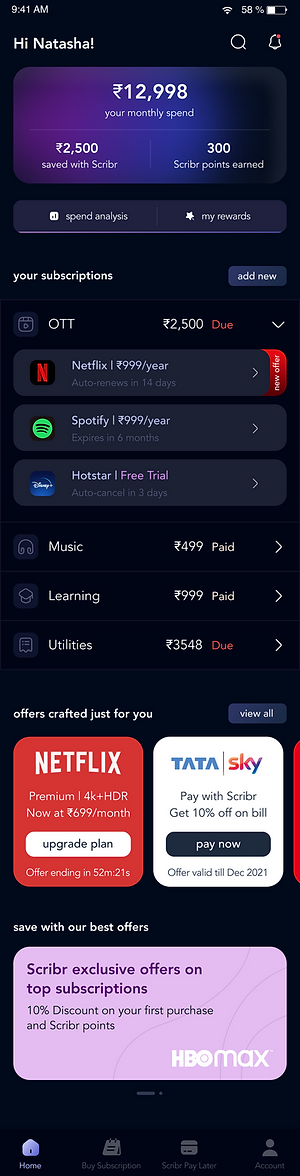
We created the information architecture from the information drawn from the UX analysis. Based on IA, fast UX iterations were created to give shape to the UI and for further testing. With two rounds of iterations, we conceptualised an interface that gives users an overview of their total spending and running offers customised to their profile. To boost the retention rate, an indication of the total money saved from Scribbr was introduced.
During onboarding, user's existing subscription will be collected from the number they registered with

The homepage gives quick summary of user's month spent on subscriptions and other offers on Scribbr
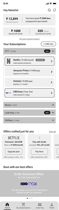
Spent Analysis is another important feature that dissects more into user's behaviour around subscriptions

Users can pay, upgrade or even delete a subscription from their Scribbr app

The product priotirised user's understanding of their spending behaviour and managing them through easy payment and upgradations. For user engagement, a point collection system was introduced that they can redeem through a different game based activity.
Visibility of System Status
Users' journey from the onboarding to the homepage gives a quick overview of what to expect and how to accomplish their primary tasks, which benefits casual users. For the savvy adopters, the user-engaging features were given quick shortcuts.
Aesthetics & Design
The UI aligns with the focus given to two different user groups. The primary tasks are very simple and easy to complete whereas, fun engaging interactions are introduced for the savvy adopters.
Effective Information Architecture
No matter which user group is engaging, the IA prioritises users' needs to manage their subscriptions and intuitively complete the payment process without friction. The secondary emphasis is towards sales through the app that is accomplished through reward system interaction.
OVERVIEW OF THE FINAL DESIGN
The branding was designed keeping in mind the vision of the product. It was fun, sharp and accessible
Followed by the primary action points, users are reminded about the immediate actions they need to take on different subscriptions
The bottom navigation bar benefits a recurring user who uses the app to quickly accomplish their intended tasks
Users have a quick overview of how much they are spending on different subscriptions. Additional features help user to get more information on their subscription spending behaviour
The benefits of using Scribbr and customised sales offers are displayed here for users to give simple nudges.
1
2
3
4
Onboarding actions tracks the pre-owned subscriptions


During onboarding, user's exisiting subscription will be collected from the number they registered with different companies
Design consistency was maintained in primary actions for upgrading and buying a new subscription on the platform

Go to previous project

VALIDATIONS
Two Usability tests were conducted with the MVP design which led to following observations,
-
The users were able to differentiate between the primary actions and the secondary user-engaging actions. The whole journey of following the details of an existing subscription plan and viewing other offers tagged with the particular subscription took under 4 minutes for a new user
-
Users' learned more about the product offering through personalised insights of the spend analysis feature.
Go to previous project

